Make the Estimate Warning triangle more prominent
13
votes
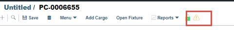
The warning triangle is rather difficult to see on an Estimate.
Please make this more prominent (Bolder, brighter / more effective colour)
Comments: 1
Oldest
•
Newest
•
Most likes
•
Fewest likes
-
10 May, '21
Per Ostman AdminReleased 10 May 2021 - the estimate validation icon has been updated and increased in size for visibility.